Last updated
How to create an FAQ page
Learn how to use Pages to build an FAQ content page
Table of Contents
- Getting started
- Deciding how the page is structured
- Setting the page name and URL address
- Creating the Hero Section
- Adding questions and answers using Sections and Blocks
- Creating the first question Section
- Creating the second questions Section
- Creating the third question Section
- Creating a carousel
- Dealing with errors
- Setting the page live
This article provides step by step instructions on how to use Pages to build an FAQ page. It assumes you know basics about how Pages work covered in this guide.
Also, to get an idea of what we’re about to create, you can see the end result, i.e., the FAQ page we’ll create in this tutorial by clicking the link below.
Getting started
Find the Pages feature in Console. Navigate to your test (or development) environment, pick the “Build” section from your top bar, select “Content” from the sub-menu, then select “Pages” from the left side menu. You should now see your default content pages (the About page, the Landing page, the Terms of use page, and the Policy page) ready for editing.
You can determine which environment to use by checking the location of the "Copy to Live..." button in Flex Console > Build > Content. If you can see the button when you are in Dev, follow these instructions in Dev. If you can see the button in Test, follow these instructions in Test.
If you don't have the feature available in Console and want to start using it, check out our article about enabling the Pages feature in your marketplace.
Deciding how the page is structured
The first step to building a new page is getting familiar with our tools. Your page will be composed of different Sections. Sections determine how your content is laid out and where it appears on the page, and you can reorder them easily by dragging them in the proper order in the editor.
It is good to distinguish Sections by purpose. For example, our first Section, which we will call the Hero Section, is about introducing what our FAQ page is all about. Though a Hero section isn’t strictly necessary, it’s often used at the top of the page.
The actual information or content shown in a Section is created with Blocks. Blocks have Fields that house information like the image for our Hero Section and the questions and answers.
There are multiple approaches to building a page: you may want to create it ‘as you go’ Section by Section and hone the final result once it’s done, or you might prefer to first visualize a draft of the complete page structure from start to finish, and only then start to work on each Section. Both approaches can work, though this guide focuses on the more structured approach.
So, we assume that we already know what the structure of the page will be like, and we’ll be creating it Section by Section and skip the design phase. The FAQ page will start with a Hero Section that works as an introduction to the page, with a brief explanation of the page’s contents in a single-column format.
We’ll create two additional three-column Sections for the question and answer content. Each question and answer pair will be a column of its own. We’ll then create one additional multi-column Section for users who still have more questions. Finally, we’ll end with a carousel-type Section that has a few user reviews.
When you’ve decided what the page structure is going to be, you can go straight to creating content.
Setting the page name and URL address
When you create a new page, you’ll need to set a specific name for it. This is known as the Page ID, and it also automatically becomes the URL address of the page. The name and URL address of each page you create are permanent and can’t be changed later on, so choose wisely!
Still, you can of course always create a new page with a different ID. Just remember that if you change the Page ID, the URL address also changes, and that can result in broken links if there are links elsewhere that lead to that page. Generally, we recommend that you don’t change existing Page IDs or URL addresses unless necessary.
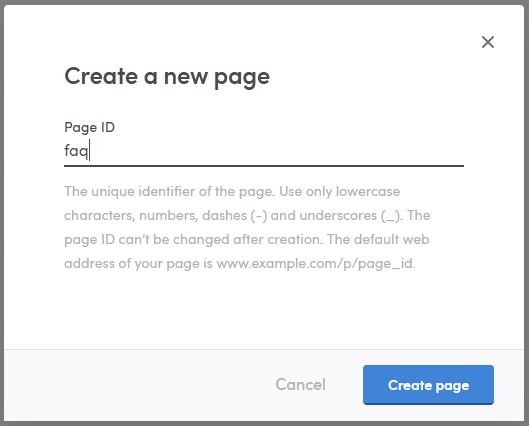
So, we’re now in the “Pages” area of the Flex Console. To create a new page, we’ll click “+ Create new page…” at the bottom, and then we get a pop-up window. We want a short and self-explanatory URL address and name for the page, so we’ll just use “faq” as the Page ID. Then we click on “Create page”, and voilà – an empty page has been created! Now, you can click on the “Edit content” text in the Pages area to start shaping it.
Reference images:
Creating the Hero Section
Let’s first create an introduction where we tell our users what the FAQ Section is all about. We’ll create our introduction using a Section using the single column template and with a fitting title and a text block, no call to action, and a Section appearance of our choosing. We don’t need to create additional Blocks because we do not want to include any other content in this Section. Note that you can also use Markdown when editing content with Pages. Markdown enables you to easily format text with bold characters and italics, it allows you to create lists, and much more.
The top Section of a website that people see first when visiting your page is called the ‘Hero’ Section. In many cases, it includes a large picture, often in the background. Additionally, there can be text and potentially a ‘call to action’ which can essentially be something as simple as a button that says “Sign up” or “Browse listings” and has a link to that page.
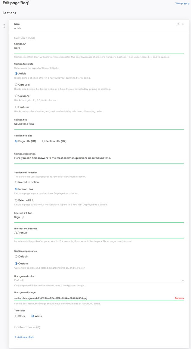
Let’s first go through the basics. We’ll have the Section ID simply be ‘hero’, and have the Section template be an ‘article’, as we just want one column of text and an image in the background.
We’ll need a title for the page, as well as a description. This is what users will read first when entering the FAQ page, so let’s make it descriptive. We’ll have the title be Biketribe FAQ”, referring to the name of the marketplace, set the title as “Section title (H1)” and have the ingress content be “Here you can find answers to the most common questions about Biketribe. Let’s not add a call to action; we’ll use one in a later Section, though.
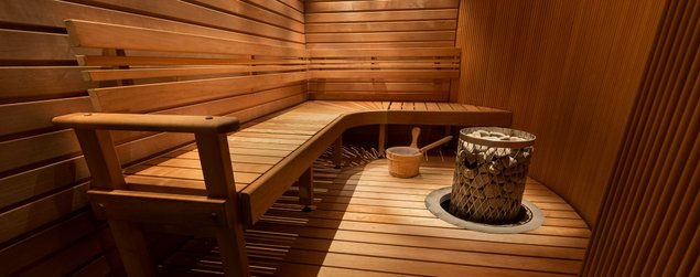
When it comes to the background, we’ll set up a background image. That means that for ‘Section appearance’, we will select ‘Custom’, we’ll leave ‘Background color’ as ‘Default’ (since we don’t want a color, we want an image) and then select the ‘Background image’ from our computer. The file selection box comes up when you click on ‘Upload an image..’.
The text color can be set based on your own preference, and it affects the text of the whole Section, including all of its Blocks. Here, let’s choose ‘White’ as it fits our background image better. This is the last setting we want to change: we don’t need any Content Blocks in the Hero Section, so we’ll skip the ‘+ Add new block’ link.
After all of the changes have been made, we’ll scroll down the page and click on the ‘Save changes’ button in order to save our new Hero Section. Save early, save often! This way you’ll avoid losing any changes in case of any technical difficulties. Now that our changes have been saved, we’ll scroll all the way up and click on ‘View page’ at the top right corner of the editor, and we’ll see our new creation!
Reference images:
Adding questions and answers using Sections and Blocks
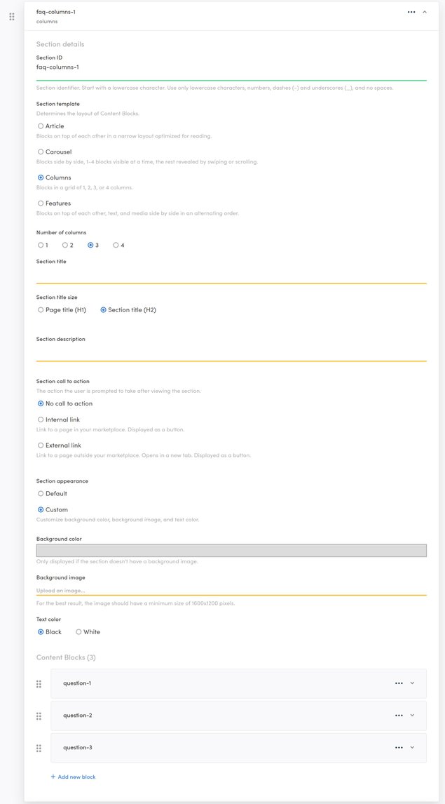
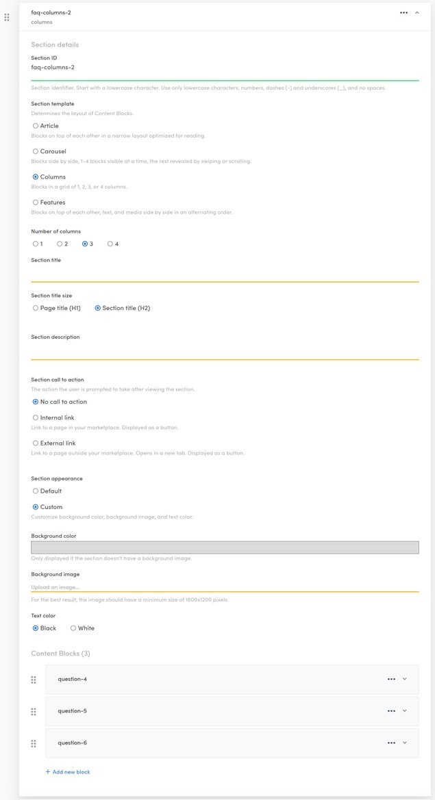
Now, we’ll create a simple Section or two that include a few columns, each of them briefly answering a question. Let’s name the Section “faq-columns-1” to illustrate that we’re creating the first column Section for the frequently asked questions.
Creating the first question Section
We’ll choose “Columns” as the Section template, and set the number of columns to 3 from the dropdown that is activated when we choose the Columns template. We don’t need a title, a description, or a call to action here, so we can leave those fields empty. We’ll use a custom Section appearance, with a light gray background color (RGB 220, 220, 220).
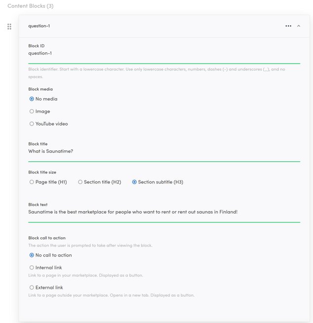
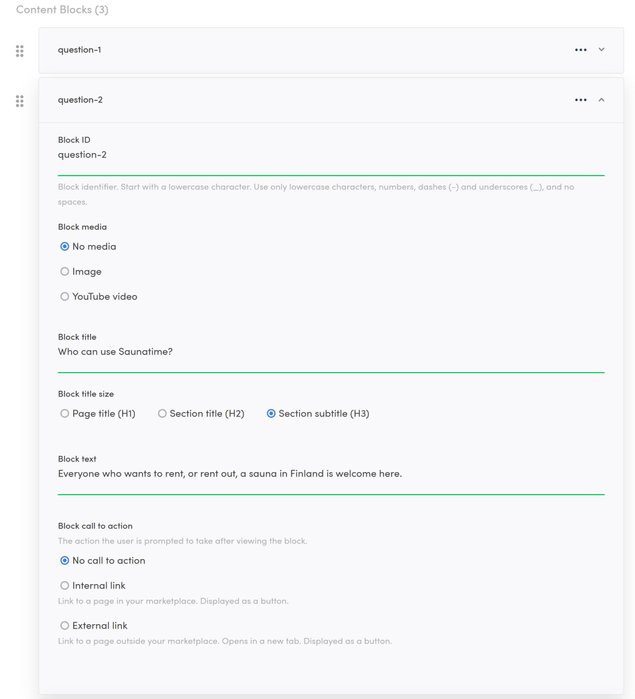
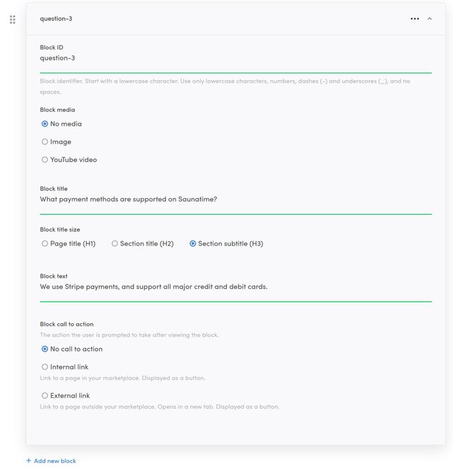
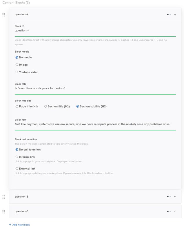
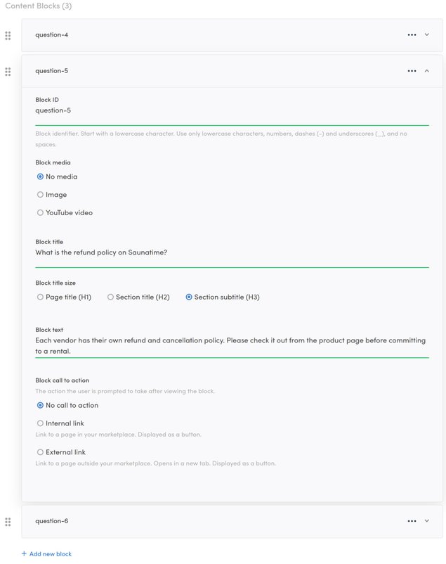
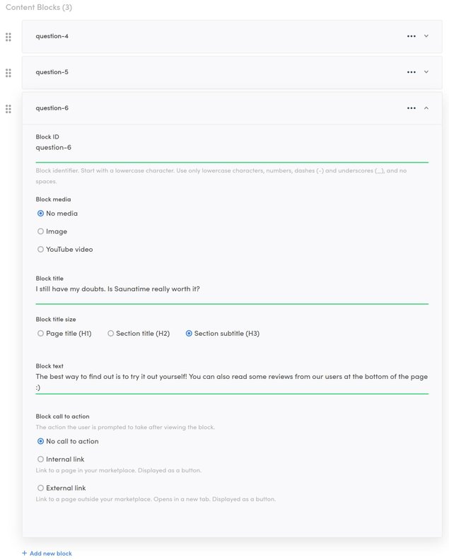
Now, the actual columns that include the questions are done by creating Blocks. We’ll click on “Add new block” at the bottom, and set the Block details.
The ID can just be “column-1” for the first Block. We don’t want any media (images or text) so we’ll leave the Media dropdown selector empty.
Let’s set a title that represents the question, and set the title size as a bit smaller than the Section title: let’s use Section subtitle (H3). The text content in the Field can be the answer to the question, and we don’t need a call to action, so let’s leave that part empty.
After this is done, we can save our new Block with the “Save changes” button on the bottom of the page, and then repeat the process twice, creating two new blocks that represent the two new columns.
Reference images:
Creating the second questions Section
This Section has the same layout and details as the previous one. With the second set of questions, we’ll also use the same background color as for the previous one, to make these two Sections with a total of six questions distinct from the surrounding Sections.
Reference images:
Creating the third question Section
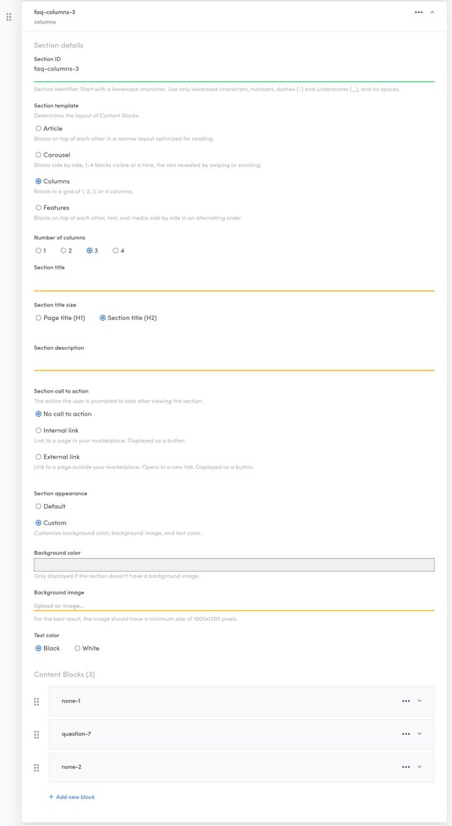
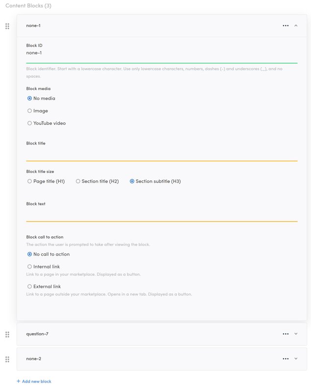
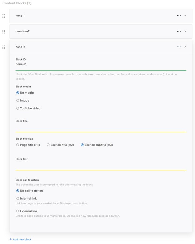
With the third question Section, we want to give people the opportunity to get in touch if they have further questions. We want to just use one column, but put it neatly right in the middle of the page, so we’ll use a trick: we leave the two surrounding columns empty. We just need to give them Block IDs (none-1 and none-2 here) and leave the rest of the Blocks untouched.
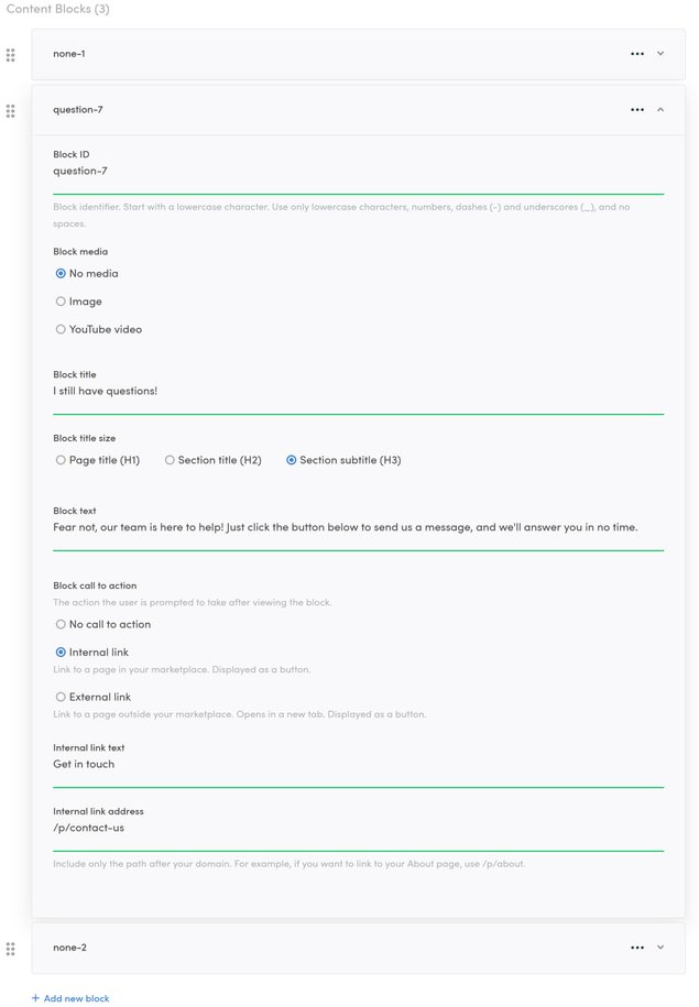
Since we want people to contact us if they have questions, let’s also add a ‘call to action’ to the middle Block. This could either be a link to an internal or an external page. In this case, we want to use an internal link that says “Get in touch”, so let’s write “Get in touch” in the “Internal link text” Field. Regarding the link address, the structure of internal links always includes the marketplace URL address, so if the marketplace was located at https://www.example.com/, all the internal links would start with that base URL address. So in order to create a link leading to https://www.example.com/p/contact-us, we just need to write “/p/contact-us” in the “Internal link address” Field - in our example marketplace, there is a live contact form at that address.
Reference images:
Creating a carousel
One of the answers in the questions is aimed at people who are still unsure whether they want to join. We’ll try to nudge them in the right direction by sharing some reviews at the bottom of the page from users who have shared their positive experiences with us.
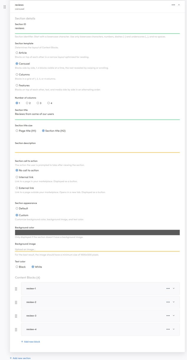
So, let’s add one more Section, and name it “reviews”. Let’s use the “Carousel” Section template, so users can browse through the reviews. Only one review needs to be in focus at a time, so let’s choose “1” as the number of columns. After giving the page a fitting title (“Reviews from some of our users”) and a proper title size (H2), we’ll set the appearance. We do not need any description or call to action here.
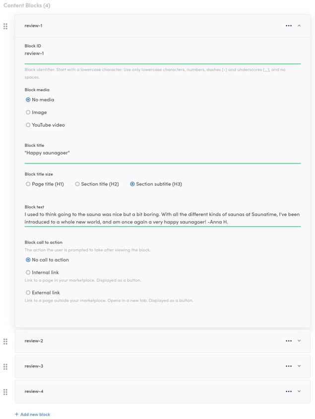
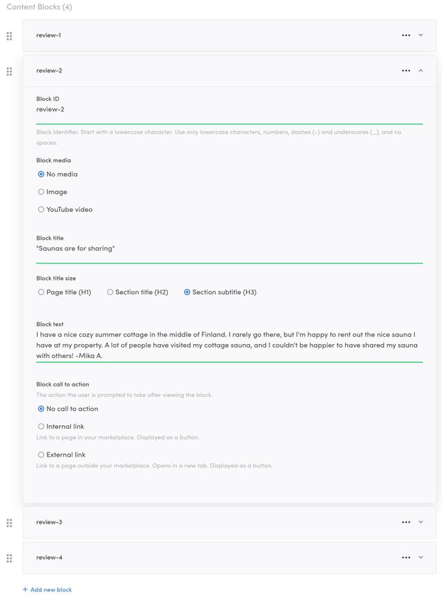
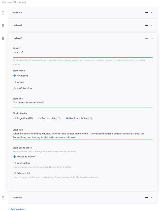
Let’s use a custom appearance, with a different background color from the other Sections (RGB 90,90,90) and white text. Then, we can add as many Blocks as we want the users to be able to browse through, in this case, 4. Each of these Blocks can get a fitting ID (such as review-1), a quote from the review in the title, and the full review in the ‘Block text’ Field.
This is the last Section we’ll create: the footer of the marketplace automatically appears at the very bottom of the page.
Reference images:
Dealing with errors
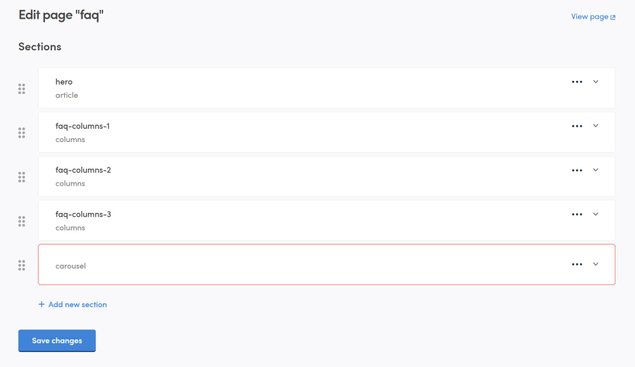
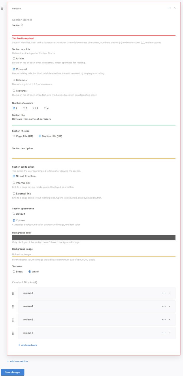
Sometimes when trying to save the page, you may run into an error. If the page is not fully functional and you try to save the changes, a red outline is created around the section(s) that need fixing, and the changes are not saved. For example, if you create a new Section and otherwise fill it out properly but do not give it a Section ID, you won’t be able to save the page before giving a name to that Section, because every Section needs an ID.
If, when you are saving your changes, you don’t see a checkmark and the “Save changes” button does not become grayed out, it means that the changes were not saved. In this case, scroll up to the Section(s) outlined in red, and open them. You will find the error message typed out under any field that needs to be fixed.
Reference images:
Setting the page live
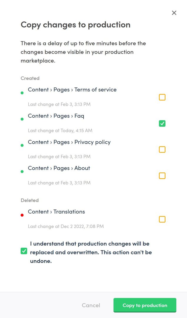
Now that we’ve created the page and made sure it works as supposed, all that’s left is to move it to the Live environment. This can be done by clicking the blue button “Copy to live…” on the left side bar.
When you click on the button, you’ll get a pop-up asking you to confirm that you wish to move all the changes to Live. You don’t need to move all of the changes at the same time, though: if you have made multiple changes to different pages, you can pick and choose which ones you want to move to Live.
A word of warning here, as well: if you've made changes directly to your Live environment, those changes will be overwritten. This action cannot be undone.
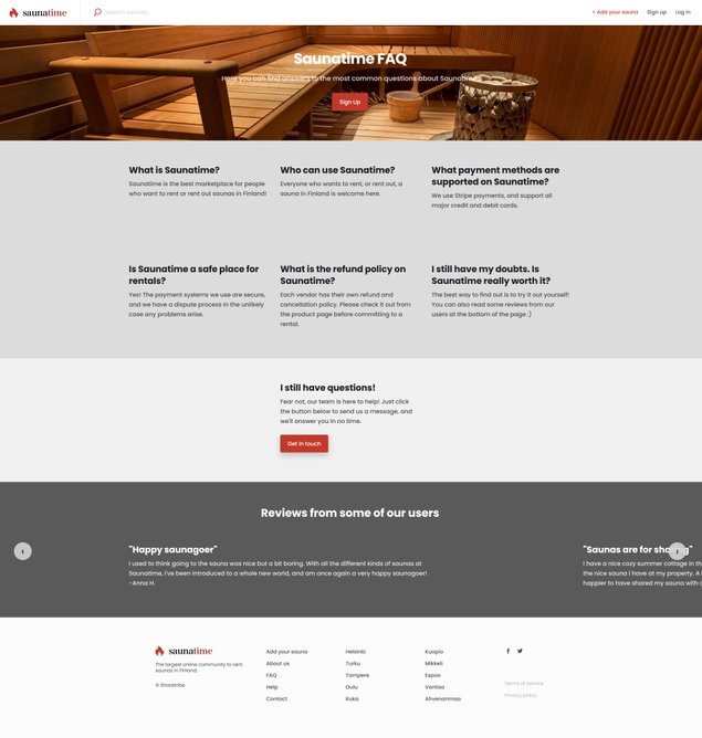
Success - the FAQ page is now created and live on our marketplace! You can see the result below. This tutorial might end here, but the journey doesn’t need to stop here: we can still edit the content of the page at a later time if needed, and of course, create other pages that serve different purposes.
Reference images:

